7 Do’s and Don’ts of Dataviz

Data Visualization Infographic

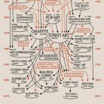
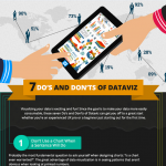
Visualizing your data is exciting and fun! Since the goal is to make your data more easily consumable, these seven Do’s and Don’ts of Dataviz can get you off to a great start whether you’re an experienced UX pro or a beginner just starting out for the first time.  7 Do’s and Don’ts of Dataviz by Infragistics WPF Controls. Read more »

Is Your Logo A Cliche?

They say that you only get one chance to make a first impression, and for many businesses that first chance is their logo. No one wants a forgettable, monotonous logo design. Yet there are countless businesses that use the same old tired logo clichés to represent them. You know what I’m talking about: a realty company with floating rooftops, abstract people made from swooshes and […] Read more »

Tangerine Tango 2012 Pantone Color Of The Year

Pantone Color of the Year Tangerine Tango 2012 Infographic

Tangerine Tango 2012 Pantone Color of the Year! “Sophisticated but at the same time dramatic and seductive, Tangerine Tango is and orange with a lot of depth to it,” said Leatrice Eiseman, executive director of Pantone Color Institute. Previous Pantone Colors of the Year 2012:  Tangerine Tango 2011:  Honeysuckle 2010:  Turquoise 2009:  Mimosa 2008:  Blue Iris 2007:  Chili Pepper 2006:  Sand Dollar 2005:  Blue Turquoise […] Read more »

History of Graffiti and Street Art

The history of graffiti and street art infographic is a telling picture of how abstract expressionism transfered to graffiti and the public art of today. We can gather a lot of  information from how one could say that Sydney Pollock led to the gang graffiti of today. It is very unique to see how that digital art that we use today comes from the imagination of the […] Read more »